 Inked Mythos
Introduction to Color Theory in 2026 Tattoo Art
Contemporary tattooing in 2026 blends artistic vision with scientific understanding of color. Artists and clients now prioritize palettes that evolve with cultural shifts while ensuring longevity on skin. This guide explores dominant hues, technical applications, and practical advice to create innovative, enduring tattoos beyond fleeting fads. Color theory provides the foundation for selecting complementary shades that enhance visual impact and resist environmental degradation over time. By understanding hue, saturation, and value relationships, tattoo professionals deliver designs that remain vibrant for decades rather than years.
Emerging Color Palettes Dominating 2026 Trends
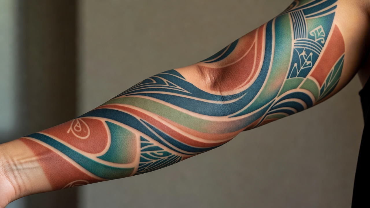
Modern tattoo trends favor muted earth tones mixed with vibrant accents. Think soft terracotta paired with electric teal or sage green alongside deep burgundy. These combinations reflect a move toward personalized, nature-inspired designs that photograph well under varied lighting. Artists draw from digital art influences, incorporating gradients that mimic aurora borealis effects for unique sleeves and back pieces. Additional palettes include dusty rose with slate blue for minimalist geometric work and warm ochre tones accented by cool indigo for nature motifs. Clients seeking modern ink often request custom mixes that avoid oversaturated primaries in favor of desaturated tones for sophisticated results. These choices align with broader cultural preferences for sustainable aesthetics that age gracefully.
Seasonal influences play a role, with cooler palettes rising in fall and warmer metallics peaking during summer festivals. Experimentation with iridescent finishes adds dimension without compromising wearability on active lifestyles.
Selecting Hues for Diverse Skin Tones
Successful color application begins with skin tone analysis. Fair skin accepts cooler blues and purples vibrantly, while medium to deep tones benefit from warmer oranges and yellows to achieve contrast. Artists test pigments on less visible areas first, adjusting for undertones like pink, golden, or neutral. For individuals with cool undertones, greens and purples create harmony, whereas warm undertones pair best with reds and golds to prevent muddy appearances. Darker skin tones often showcase high-contrast blacks with metallic silvers for depth, while lighter complexions allow for delicate pastels that might wash out elsewhere. Always consult a professional for personalized matching rather than generic charts. Factors such as melanin density and healing responses further influence final outcomes, requiring artists to adapt ink formulations accordingly.
Saturation Techniques for Vibrant, Balanced Results
Saturation control determines tattoo impact. High saturation delivers bold statements suitable for statement pieces, while lower levels create subtle, artistic shading. Techniques involve layering thin coats and using diluents to soften edges. Modern tools like rotary machines allow precise ink delivery for seamless blends. Over-saturation risks bleeding, so artists space sessions to let skin heal between layers. This method ensures colors remain true without patchiness. Additional approaches include stippling for texture and whip shading to build gradual transitions that mimic natural light and shadow. Clients can request mockups on practice skin to preview saturation levels before committing to the final design.
Lightfastness Comparisons and Longevity Factors
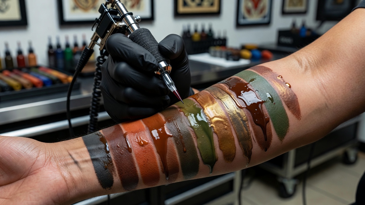
Lightfastness measures how well pigments resist fading from UV exposure. Inorganic pigments generally outperform organics in durability tests. Clients should compare options during consultations, prioritizing inks rated for high resistance. Maintenance with SPF protects investments long-term. FDA guidelines on cosmetic pigments offer further regulatory context for safe choices. Comparisons show that carbon-based blacks retain intensity longest, followed by iron oxides in earth tones, while organic reds and yellows require protective measures. Environmental factors like frequent swimming or tanning beds accelerate breakdown, making aftercare protocols essential for preserving vibrancy across all skin types.
Seasonal Fad Influences on Color Choices
Trends shift with global events and social media. 2026 sees renewed interest in bioluminescent-inspired glows and retro-futuristic neons balanced by natural dyes. Seasonal fads encourage experimentation but experts advise timeless bases with trend accents for versatility. Spring collections often highlight soft pastels, while winter favors deep jewel tones that evoke coziness. Understanding these cycles helps clients select designs that transcend temporary hype and remain relevant through multiple seasons.
Practical Steps for Clients Briefing Artists
- Compile reference images showing desired mood and palette.
- Discuss skin tone specifics and lifestyle factors like sun exposure.
- Request lightfastness data and saturation examples from the artist portfolio.
- Outline placement and size to guide color intensity decisions.
- Schedule follow-up sessions for touch-ups if needed.
These steps foster collaboration and minimize revisions. Additional preparation includes sharing medical history related to skin sensitivities and establishing clear expectations about healing timelines, which typically span four to six weeks per session.
Real-World Examples of Contemporary Ink Applications
A popular forearm piece features a gradient from deep forest green to soft gold on medium skin, using layered saturation for dimension. Another example includes a full back design with muted lavenders and coppers that shift subtly in daylight, demonstrating successful lightfast choices. A third application showcases a thigh tattoo blending warm terracotta with cool teal accents on fair skin, where precise saturation techniques prevent color bleed during the healing phase. These applications highlight how theory translates into wearable art that adapts to individual anatomy and movement.
FAQ: Common Color Choice Mistakes and Maintenance Tips
What mistakes do clients make with color selection?
Choosing overly bright hues without considering fading or ignoring skin undertones leads to disappointing results. Always prioritize tested palettes over trends alone. Additional errors include neglecting to review healed examples in the artist's portfolio or failing to account for body areas with higher friction that accelerate wear.
How should tattoos be maintained for color retention?
Apply broad-spectrum sunscreen daily and moisturize regularly. Avoid prolonged sun exposure, especially in the first year. CDC resources on skin health provide supporting advice. Consistent hydration and gentle cleansing routines further support pigment stability across diverse skin conditions.
Are certain colors more prone to fading?
Yes, reds and yellows often fade faster than blacks or blues. Opt for high-lightfast alternatives when possible. Complementary strategies involve scheduling annual touch-up consultations to refresh areas exposed to daily UV.
Can color theory help with cover-ups?
Absolutely. Understanding complementary colors allows artists to neutralize old ink effectively for fresh designs. Proper assessment of existing saturation levels ensures the new layer integrates seamlessly without visible ghosting.
Mastering these elements ensures tattoos remain vibrant and meaningful for years. Consult experienced professionals to bring your vision to life with confidence. Ongoing education through workshops and pigment research keeps both artists and clients ahead of evolving industry standards.

No comments yet. Be the first!